[Font Design] Fonts used in logo designs by famous companies and brands.
Font
2024/04/19
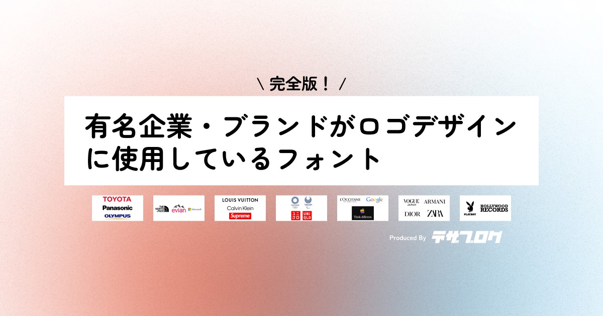
What kind of famous company or brand logos do you imagine?
There should be many logos with simple designs composed only of fonts.
This time, I will introduce the different types of Western typefaces and the fonts used in logos of famous companies and brands!
Western typefaces can be divided into "Serif" and "Sans Serif"
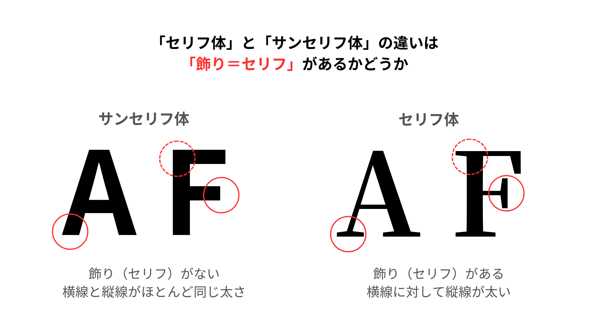
First, let me explain the types of Western typefaces.
Western typefaces are divided into "Serif" and "Sans Serif".
A serif refers to the embellishment at the end of a letter, and they are categorized based on whether they have these "serifs" or not.
"Sans Serif" ... No serifs
They are constructed with horizontal and vertical lines that are almost of the same thickness.
They were born as sign letters and are often used in commercial typefaces such as posters and flyers.
In Japanese typefaces, they resemble the "Gothic" style.
"Serif" ... Has serifs
This type has the characteristic that the vertical lines are thicker than the horizontal lines.
They look like they were written with a flat brush.
In Japanese typefaces, they resemble the "Mincho" style.
In addition, among "Serif" typefaces, they can be categorized based on the shape of the serifs.
Three types of Serif typefaces
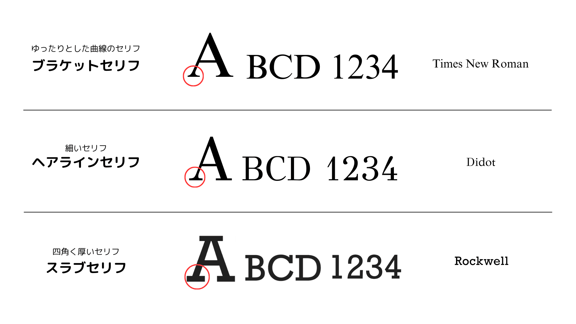
Serif typefaces can be categorized as "Bracketed Serifs", "Hairline Serifs", and "Slab Serifs" based on the shape of the serifs.
Bracketed Serifs ... Serifs with relaxed curves
They are often used in books due to their characteristic of being easy on the eyes even when written in long sentences.
A main font is "Times New Roman".
Hairline Serifs ... Thin serifs
They tend to convey a delicate and elegant impression, so they are often used in fashion brand logos and fashion magazines.
A main font is "Didot".
Slab Serifs ... Square and thick serifs
They have similar thickness for horizontal and vertical lines, and are often used for advertising titles and headlines due to their prominent thick serifs.
A main font is "RockWell".
Fonts used in logos of famous companies and brands
The logos of famous companies and brands are not designed from scratch by designers,
but are designed based on long-existing fonts like those mentioned in this article,
by adjusting the thickness of lines and spacing of fonts to fit their brand image.
Fonts that have been used for a long time are familiar to people, creating trust.
By using these fonts, the atmosphere and nuances that the font itself possesses can be communicated intuitively to many people, conveying the corporate or brand image.
Now, let me introduce the fonts used in various companies and brands' logos!
Sans Serif typefaces
Helvetica
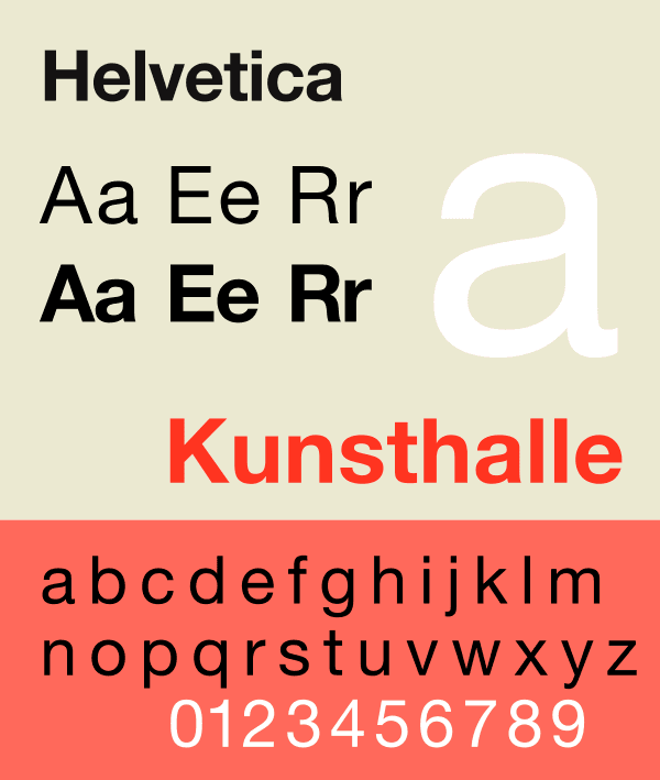
Reference: Wikipedia
This font was born in 1957 and is highly versatile, being one of the most used fonts worldwide.
It is often used when wanting to convey "standard", "universal", or "traditional".
It is said to be indispensable in the publishing and advertising industries and is a font familiar to various generations.
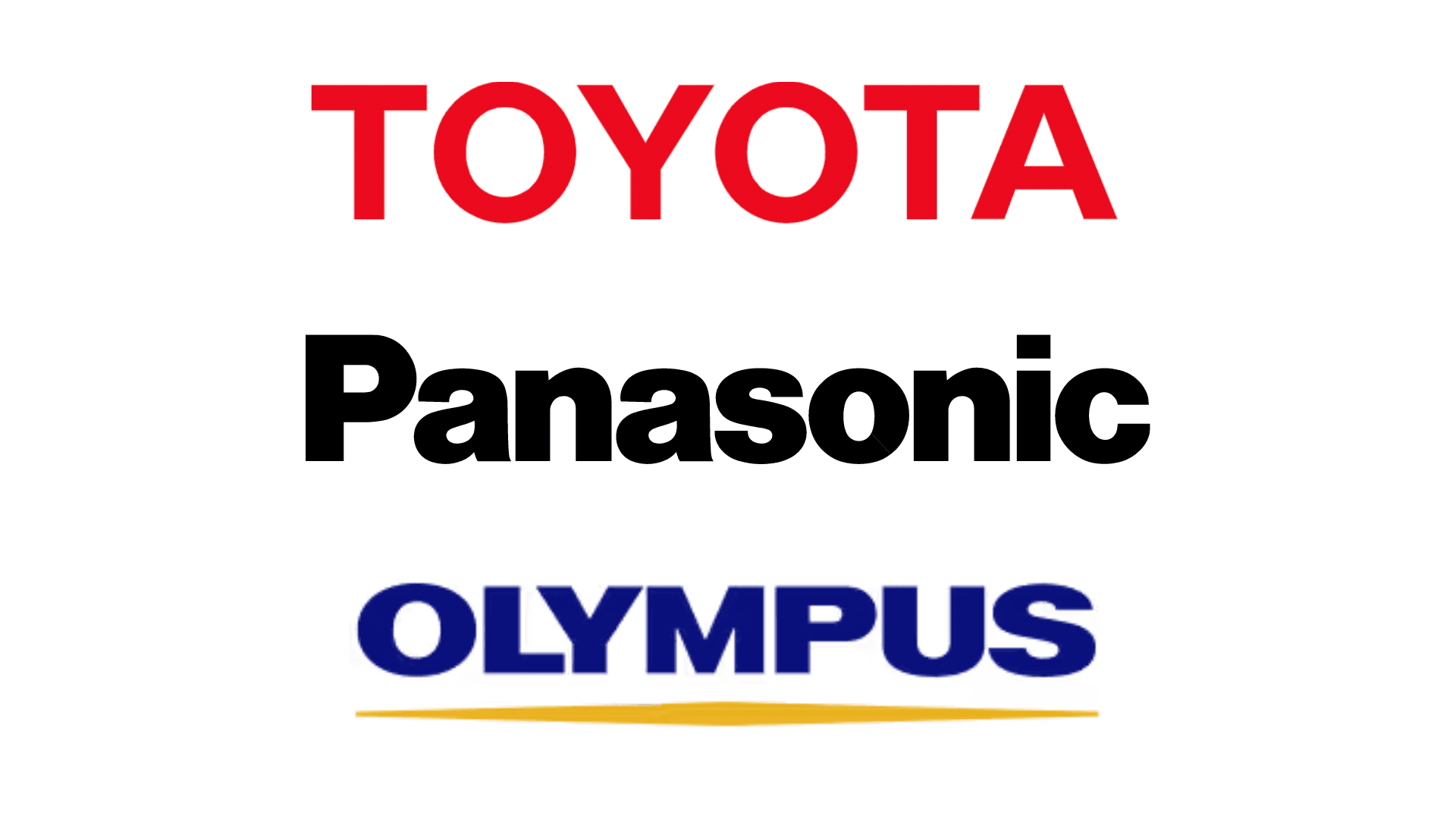
Reference: https://global.toyota/jp/
Reference: https://panasonic.jp/
Reference: https://www.olympus.co.jp/
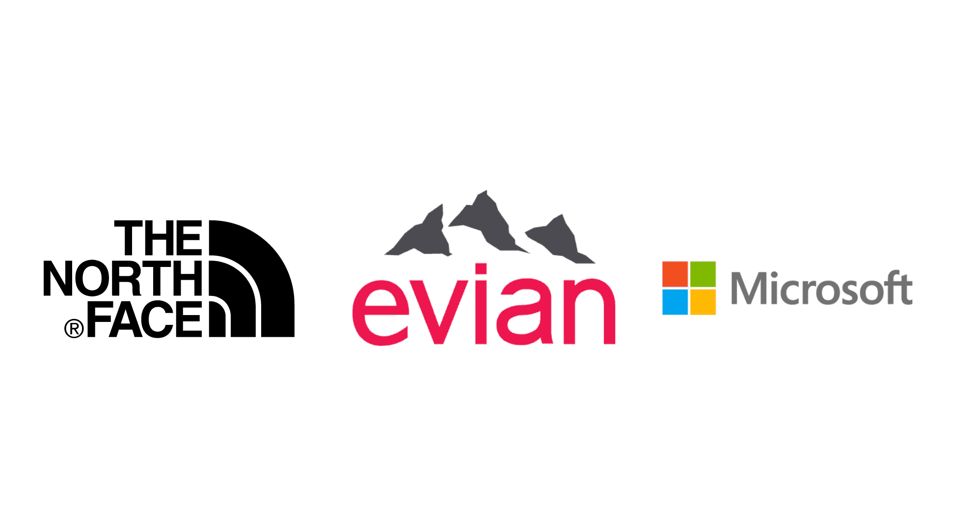
Reference: https://www.goldwin.co.jp/tnf/
Reference: https://www.evian.com/jp/
Reference: https://www.microsoft.com/ja-jp/
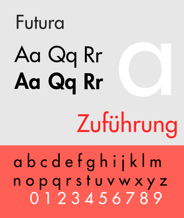
Futura
Reference: Wikipedia
This font was created in 1923, and its name is derived from "future".
It is characterized by its design based on straight lines and circles.
It is often used when wanting to convey "innovative", "unique", or "futuristic" themes.
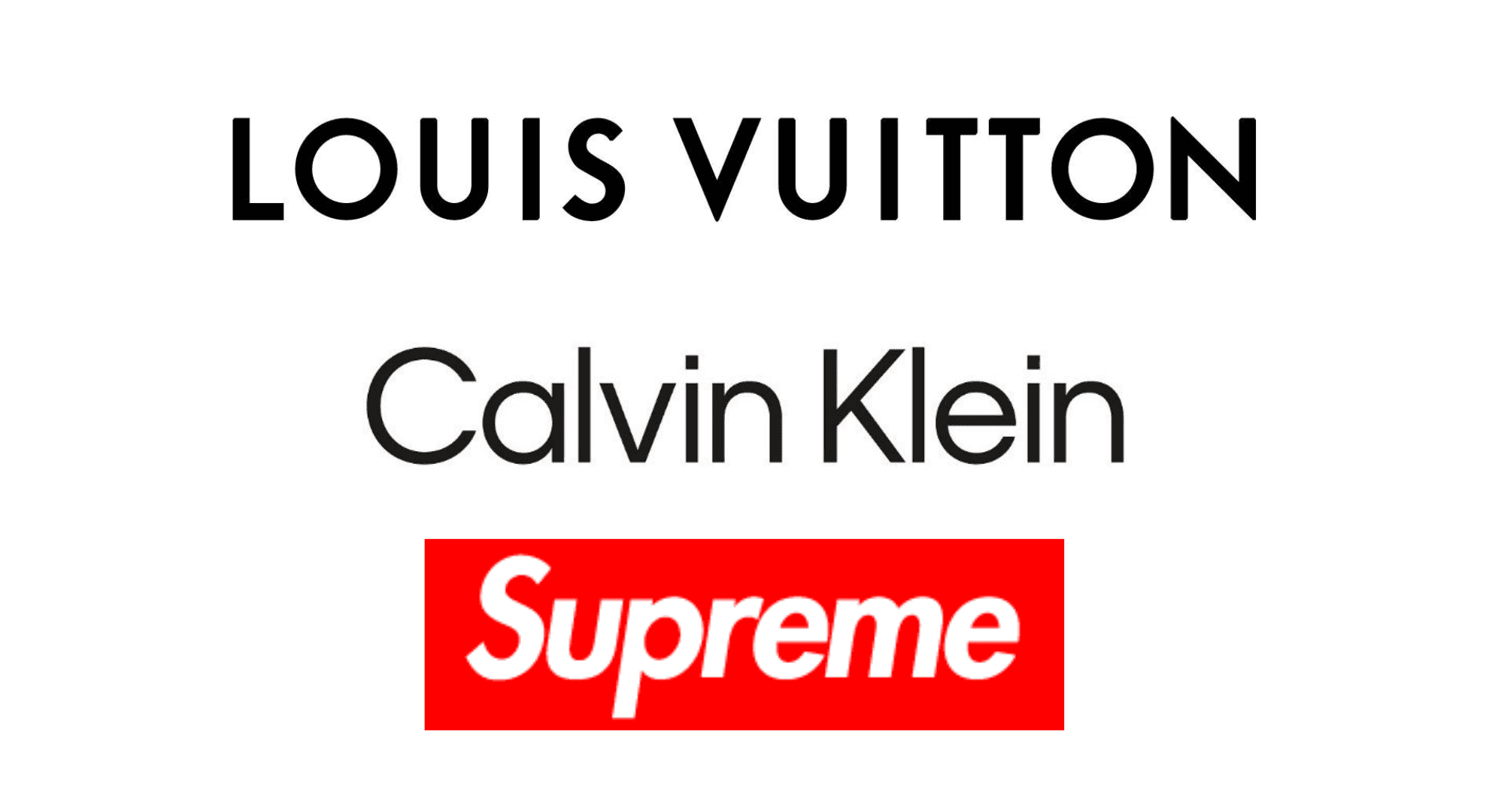
Reference: https://jp.louisvuitton.com/jpn-jp/homepage
Reference: https://jp.supreme.com/
Reference: https://japan.calvinklein.com/
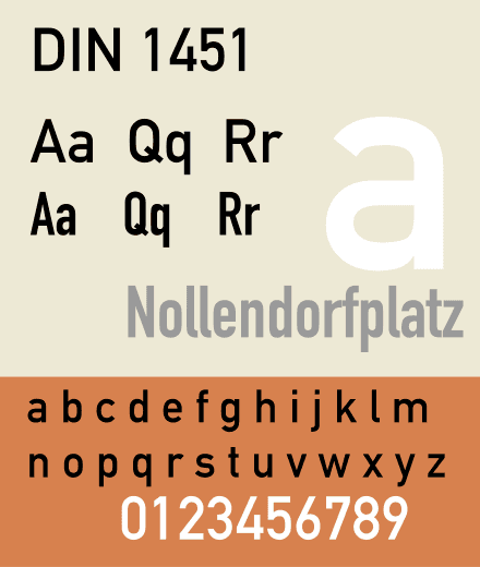
DIN
Reference: wikipedia
This font was created in the 1990s and features a geometric design,
making it highly visible, and it is used for traffic signs in Germany.
Because it has rounded and soft characters, it is often used when wanting to convey "gentleness", "mildness", or "calmness".
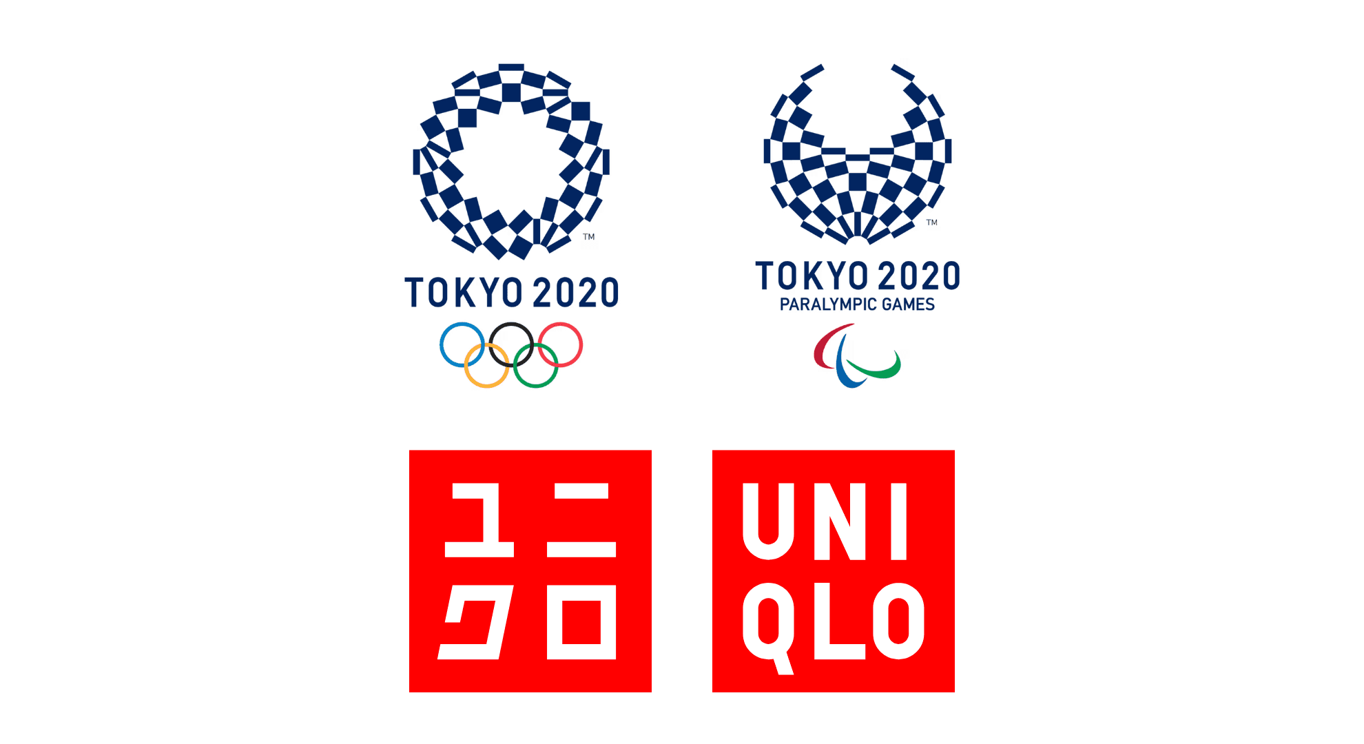
Reference: https://olympics.com/ja/olympic-games/tokyo-2020/logo-design
Reference: https://www.uniqlo.com/jp/ja/
Serif typefaces
Garamond
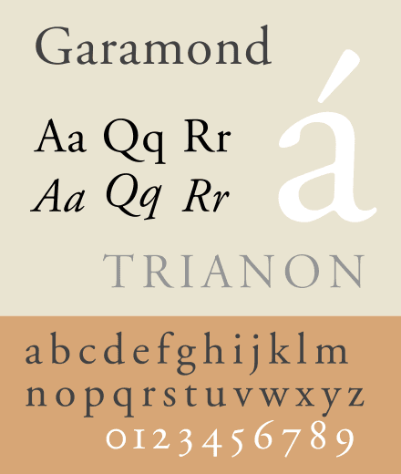
Reference: wikipedia
This font was created in the 16th century and has a slim, clean overall appearance,
giving it a soft impression.
When italicized, the swash parts of the lowercase letters bounce, giving an elegant impression, making it suitable when wanting to convey "nuance" or "elegance".
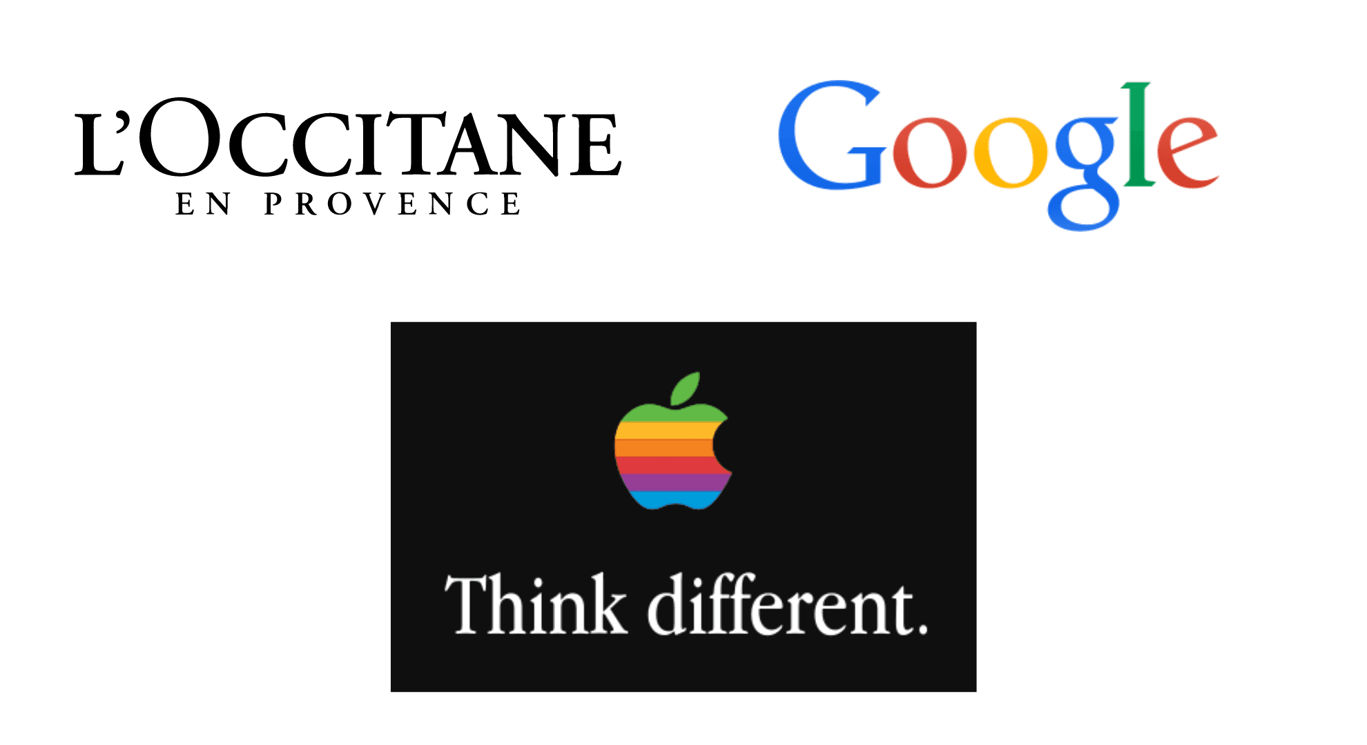
Reference: https://jp.loccitane.com/
Reference: https://ja.wikipedia.org/wiki/Think_different
Reference: https://ja.wikipedia.org/wiki/Google%E3%81%AE%E3%83%AD%E3%82%B0
*The font used in the Google logo was until 2015
Didot
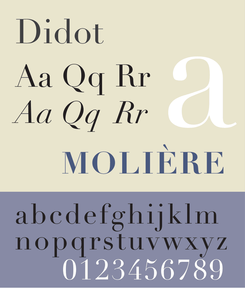
Reference: wikimedia
This font was created around 1811 and has a very thin stroke for horizontal lines,
giving it a delicate impression.
It is commonly used in women's fashion magazines.
It is often used when wanting to convey "luxury", "expensive", or "feminine".
Since its visibility is somewhat low, it tends to be hard to read when used for body text,
so it’s preferable to use it for titles.
Conversely, using it too large will lose its "thinness",
thus eliminating the delicacy that is the quality of the font, so caution is necessary.
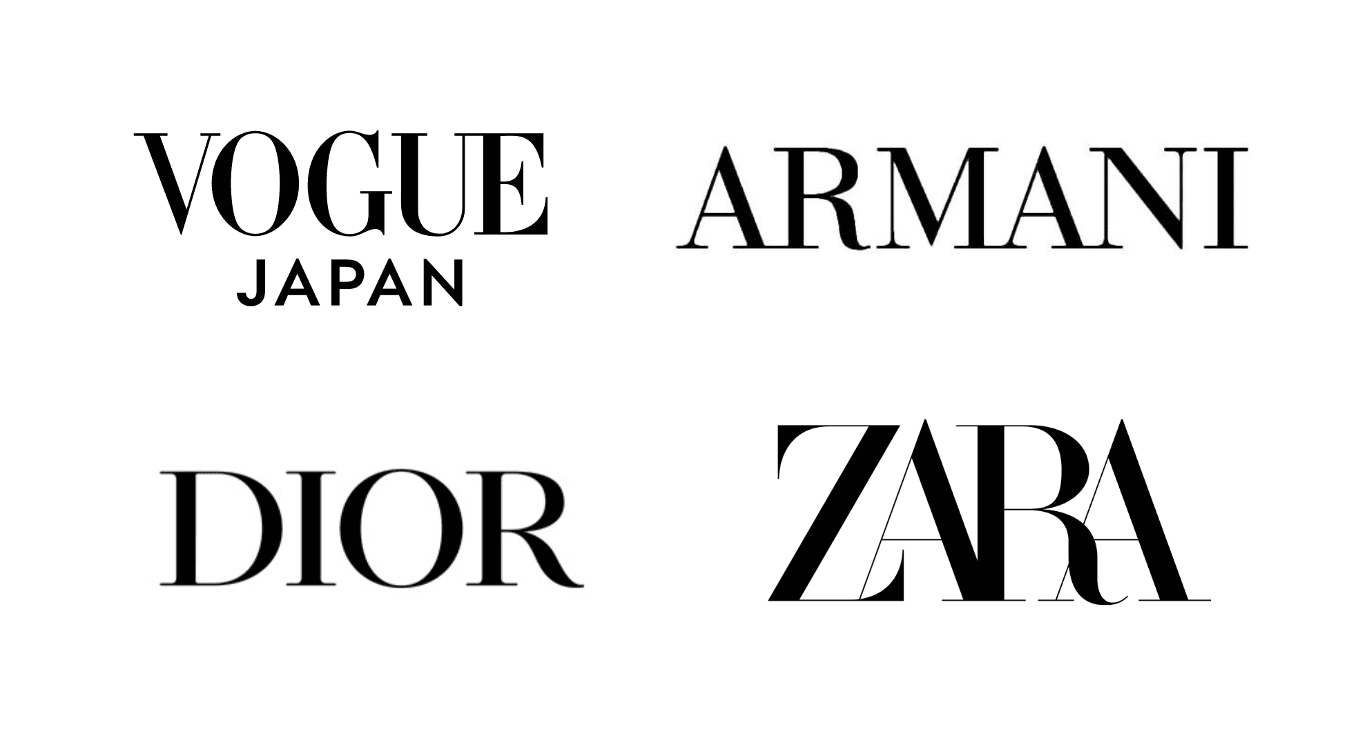
Reference: https://www.vogue.co.jp/
Reference: https://www.armani.com/ja-jp
Reference: https://www.dior.com/ja_jp
Reference: https://www.zara.com/jp/
Rockwell
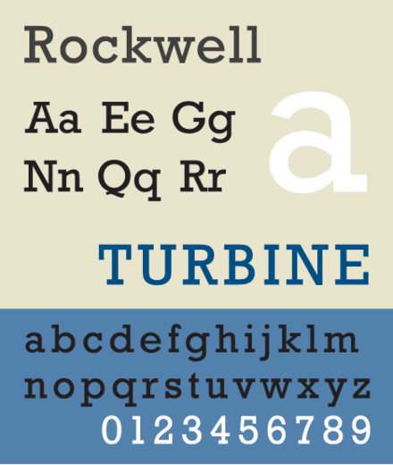
Reference: wikipedia
This font was created in 1934 and is classified as a slab serif.
It is made to stand out, with vertical and horizontal lines approximately the same thickness,
and to have large, prominent serifs, giving it a pop impression.
It is used when wanting to convey "energy", "liveliness", or "child-friendly" themes.
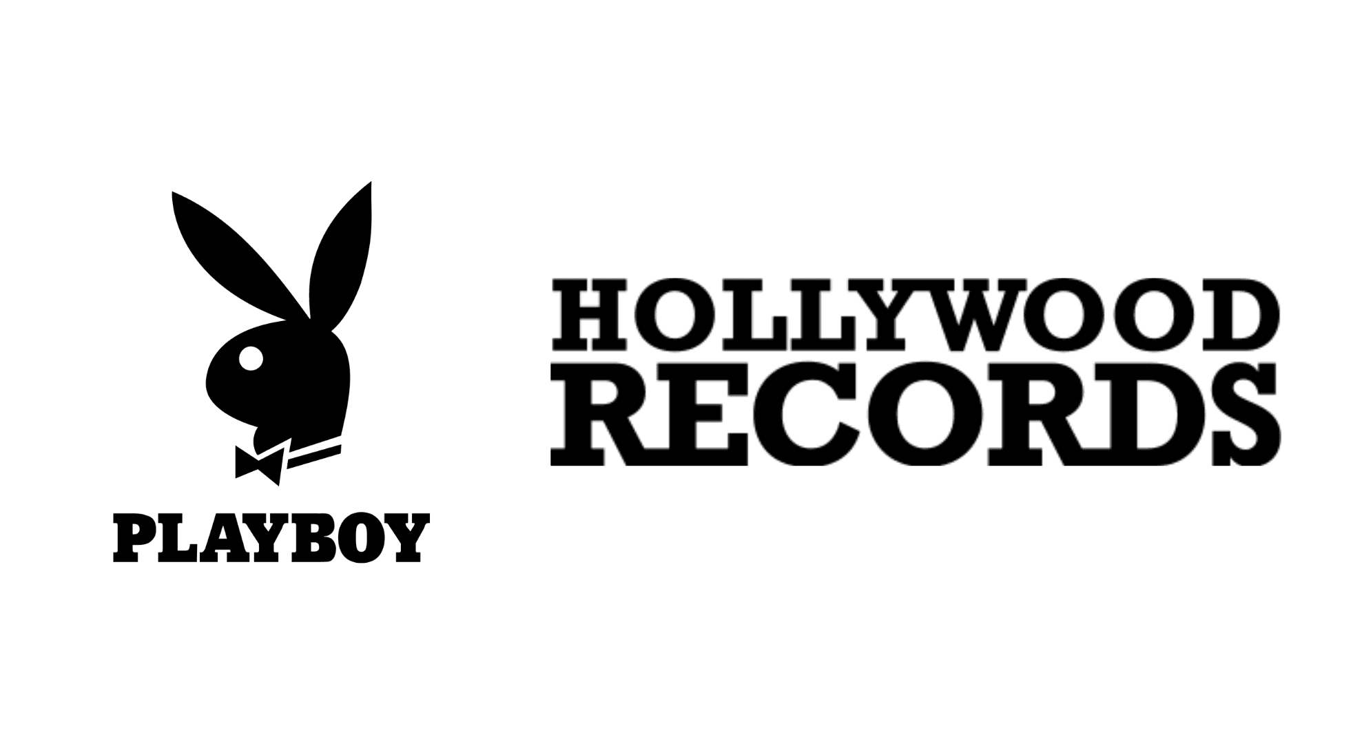
Reference: https://en.wikipedia.org/wiki/Playboy
Reference: https://www.hollywoodrecords.com/
Logos everyone knows are created from the "trust" that fonts hold
Logos of famous companies and brands are not made from scratch by designers,
but are created by finely designing based on the fonts that are familiar to us.
When using fonts,
it is important to understand the history and the impressions that people have of those fonts,
as it will lead to creating better logos and designs.
It might be good to research what kinds of fonts are used on advertisements and signs all around the city,
and why those fonts are used.

Editor
Designers Editorial Department
Designers help to enhance customers' branding with the motto of bringing the world to life through design.
We specialize in website development and application development.